In case of any questions please do not hesitate to contact us via our support at Yankee Themes Please don't forget to rate Provide and leave a nice review, it means a lot to us and our theme. Simply log in your Themeforest, go to Downloads section and click 5 stars next to the "WebPanda - Bootstrap4 Multi-purpose Responsive HTML5 Template".
WebPanda/
├── css/
│    ├── demo-categories
│        └── all (demo pages css in this folder (ie:yit-car-rental.css))
│    ├── fonts
│        └── all (font related files in this folder (.ttf, .eot, .woff, .svg, .woff2))
│    ├── fonts-icon
│        └── all (font icons related files in this folder)
│    ├── plugins
│        └── all (plugin related files in this folder)
│    ├── shortcodes
│        └── all (shortcodes related files in this folder)
│    ├── other all (root) level css files
├── js/
│    ├── plugins
│        └── all (plugin related files in this folder)
│    ├── vendor
│        └── all (library related files in this folder)
│    ├── other all (root) level js files
├── images/
│    ├── all images files with appropriate folder
├── scss/
│    ├── all scss files included with appropriate folder
├── video/
│    ├── demo video (demo.mp4)
│    ├── demo audio (audio.mp3)
├── all .html files
All the .css, html, js files are creating with appropriate comment and description, if you want to add, edit or delete in that files read the comment section for files. All the images files setup with appropriate folder.
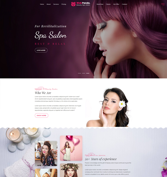
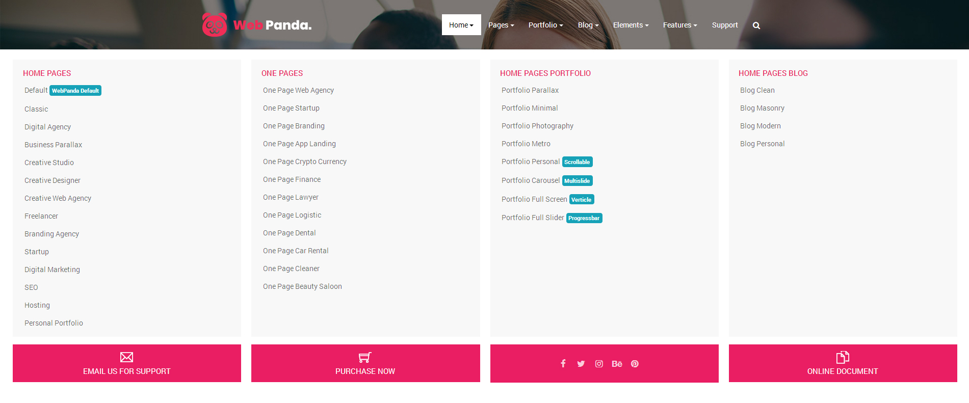
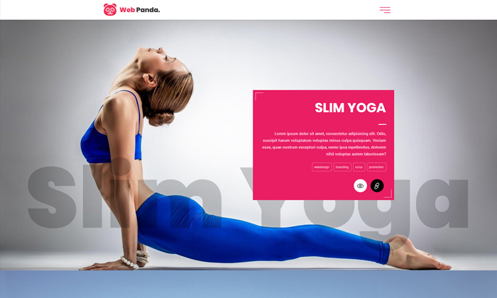
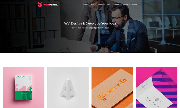
WebPanda The Most Powerful Bootstrap 4 Website Templates.
WebPanda is Exclusive multi-purpose 100% responsive template with powerful features. Simple and well-structured coding, high quality and creative, flexible layout, scalable features along with color schemes to create tailor-cut websites. With bootstrap, responsive mega menu and various layouts including incredible blog template, portfolio layouts, business pages and many more..!
Key Features
26+ Landing Pages
43+ Inner Pages
64+ Portfolio Pages
50+ Blog Pages
500+ Unique Element Style
70+ Unique Features
46+ Header / Footer Style
60+ Typography
180 Day Support
Installation
Once you've downloaded the installation file on Themeforest, Extract it and locate a file called WebPanda.zip. You can install the template by ftp installation methods.
Requirements:
Unzip the downloaded package and open the /HTML folder to find all the template files. You will need to upload these files to your hosting web server using FTP in order to use it on your website.
Directory Structure:
HTML/css - Stylesheet files
HTML/fonts – Icon font files
HTML/images - Image files
HTML/js - Javacript files
HTML/video – Video / Audio files
You should upload all or specific HTML files as per your need.
You're now good to go..! Start adding your content/images and generate your beautiful, elegant brand & new website for your business.
ZIP Contains:
WebPanda.zip
Documentation
Document PDF
HTML Markup
WebPanda follows a standard and easy to customize coding structure. Here is the sample for your reference:
WebPanda download package does not contain images which are there in our online demo. We are using placeholder images instead of real images. You will see the image code as mentioned below. You can replace placeholder image url with your image url like images/imagename.jpg
<img src="images/image-name.jpg" alt="image alt text" width="" height="">
.img-fluid is the standard class of Boostrap.
For image related classes please prefer Helper Class Section.
Favicon Setting
To change the favicon image of your site, you need to load a new ICO image in a site root or to point out a new address of the image.
If you want to create separate folder for favicon then change source path like : images/favicon/favicon.png
Font Setting
WebPanda is used Default Fonts like: Roboto & Montserrat from the Google Fonts Library. You can change the fonts from /css/style.css file in below lines. If you want to use self hosted fonts other than Google fonts then here is an example of Self Hosted Fonts. In this case you need to remove below lines and change font names in /css/style.css file as per your requirement.
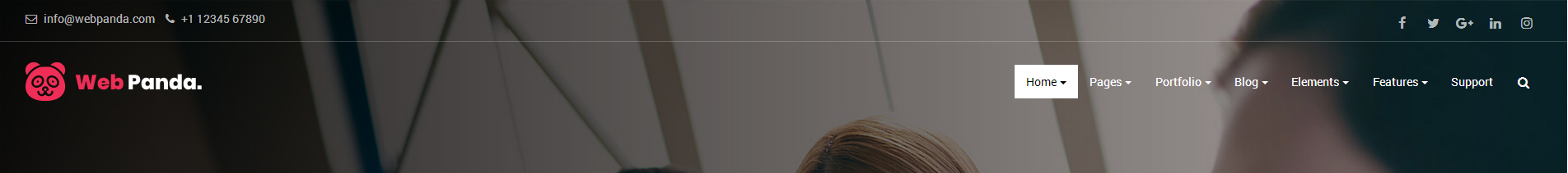
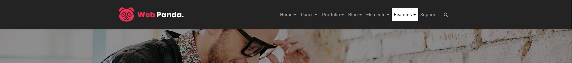
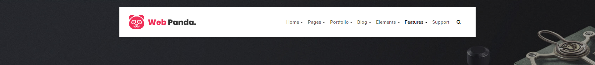
Header navigation with normal view in dark style, when user scroll on menu it will be appear in inverse style using yit-nav-inverse classs.
In inverse menu you can used two tyle of logo variation like dark and light.
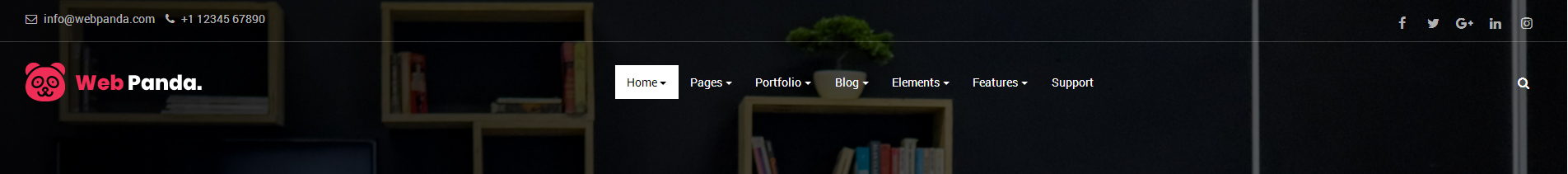
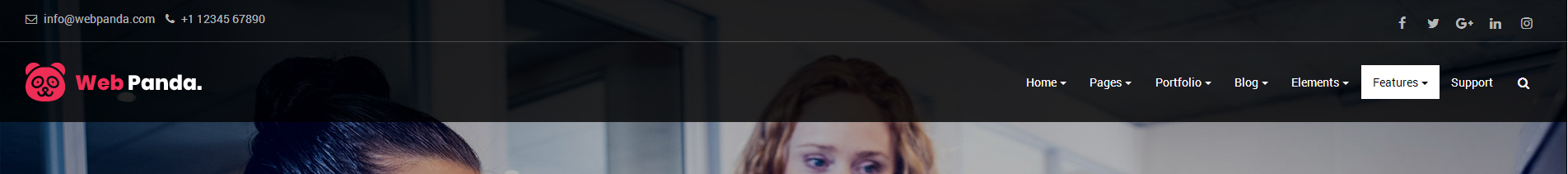
Header navigation top bar and main navigation. When user scroll on menu top bar scroll hide using yit-on-scroll-fixed and menu will be sticked on
top postion.
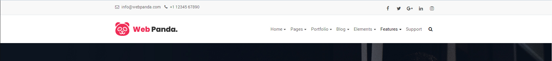
Header navigation top bar contact style to show contact information using column structure. If you want to change top bar background color check Helper Class section
for more information
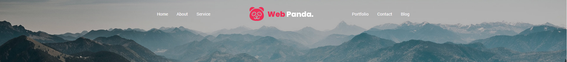
For onepage scroll navigation you can add yit-scroll-nav class in nav section, and also add appropriate id in
nav link item
<a title="Home" class="nav-link" href="#home">Home</a> for source id and applied same id in any section of your page like
<section id="home"> for destination.
Note :Below is the one page setting markup for your reference, But still if you have any confusion you can check above two demos page.
You can easily make changes in Navigation using custom classs.
Change Background Color: You can easily add your favorite color to your navigation bar by adding color class like .pink-color-bg,
orange-color-bg or whatever you want, please make sure that same css class should be there in theme.css file.
Navbar Variation Style:
.yit-nav-transparent-style for create a transparent style navigation no any solid background
.yit-nav-light-style for create a light style navigation either white or grey color background
.yit-nav-dark-style for create a dark style navigation with grey color background
.yit-nav-color-style for create a color style navigation with different color like .pink-color-bg
yit-nav-fancy-style for create a fancy style navigation, for more information please prefer fancy style navigation demo in navigation section.
Add above classes in navbar section for appplied class effect, but still if you have any query or confusion simply, prefer navigation demos for your reference. For More Info Click Here
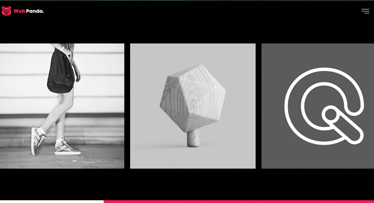
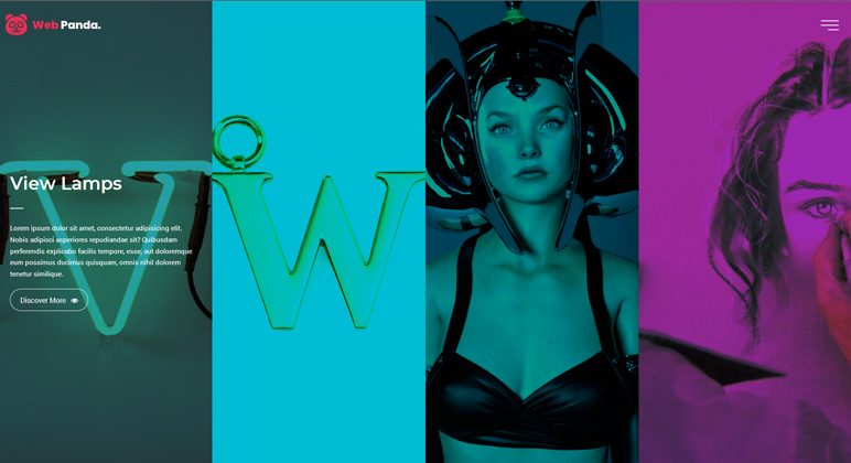
Slider Types
WebPanda Use four type of slider to create banner, sliders as mentioned below :
For slider demo just click on slider image then it will be re-direct on appropriate page.
We have created various type of slider typograhpy, please prefer our demo pages for more infomration.
Click Here
Element & Shortcodes
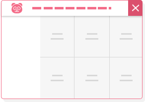
Note : We have created 65+ shortcode html pages and also each page have more variations style. If you want to use that particular shortcode in your page, just simply click on below listed pages and prefer demos for your reference.
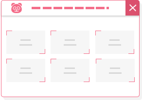
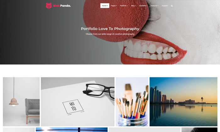
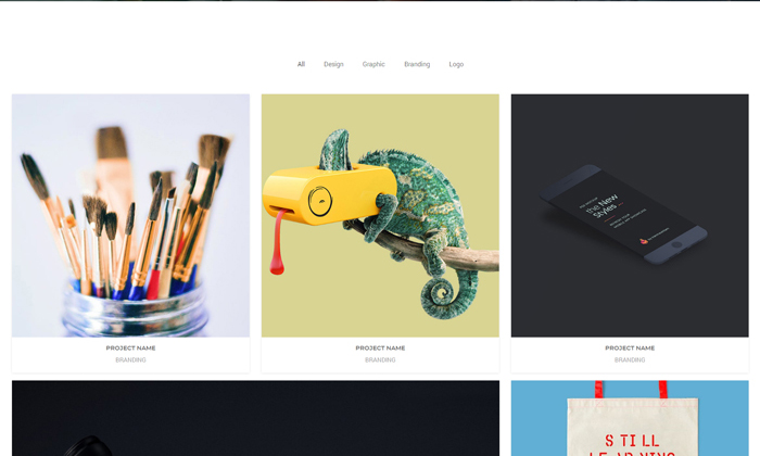
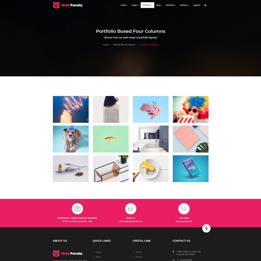
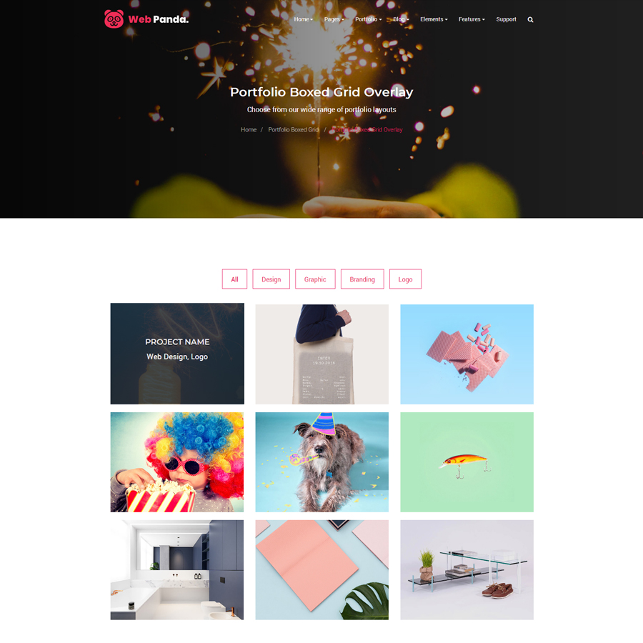
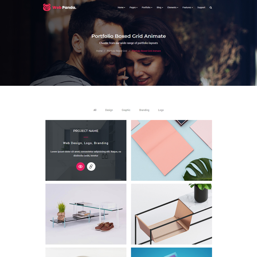
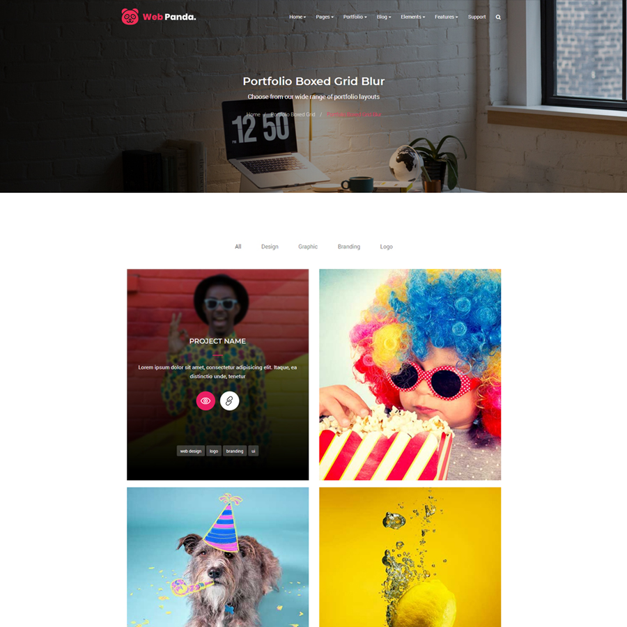
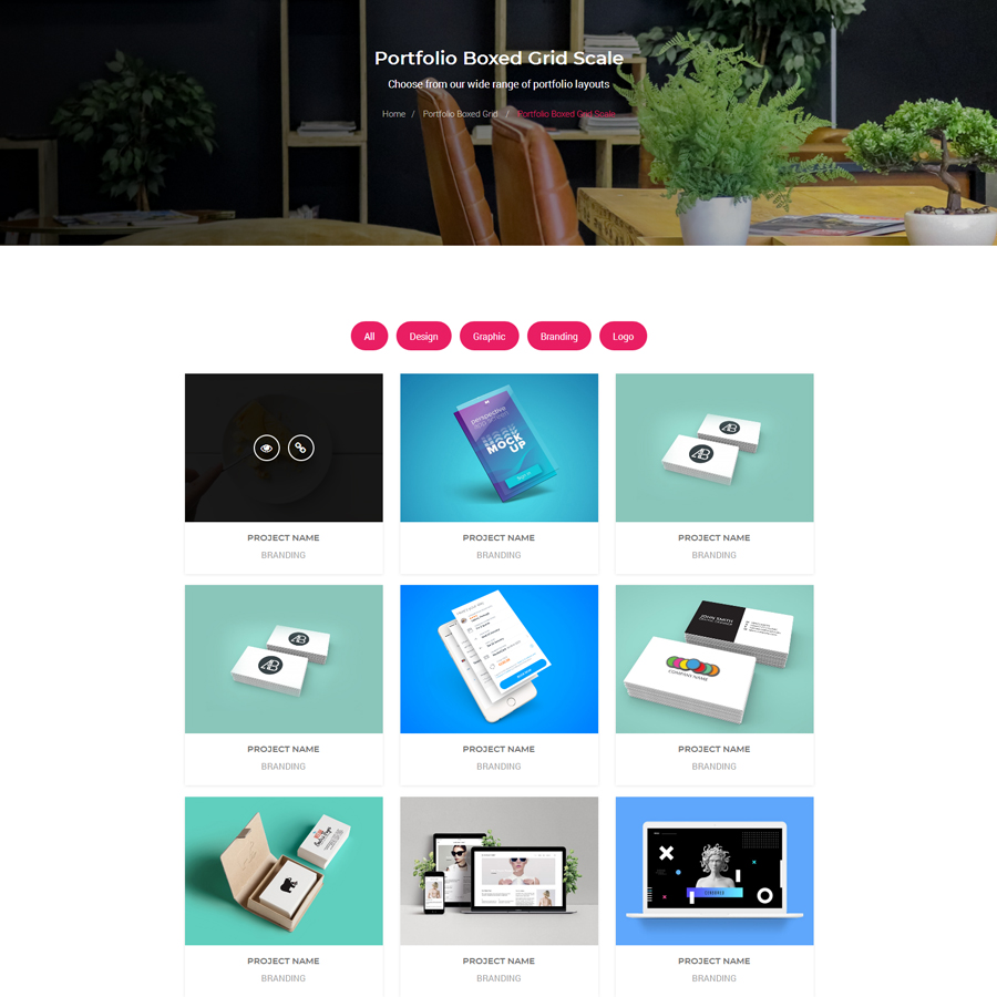
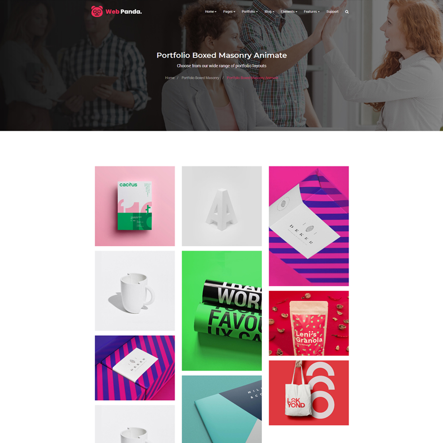
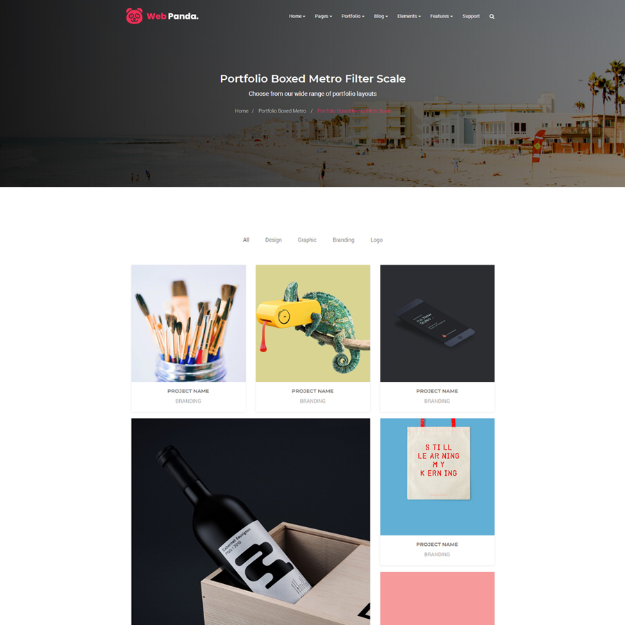
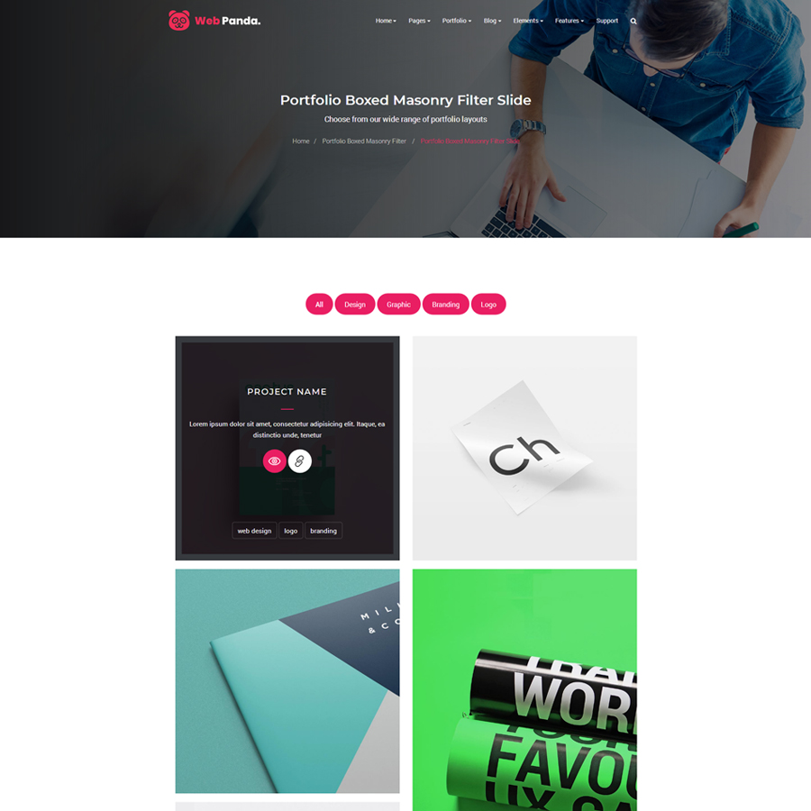
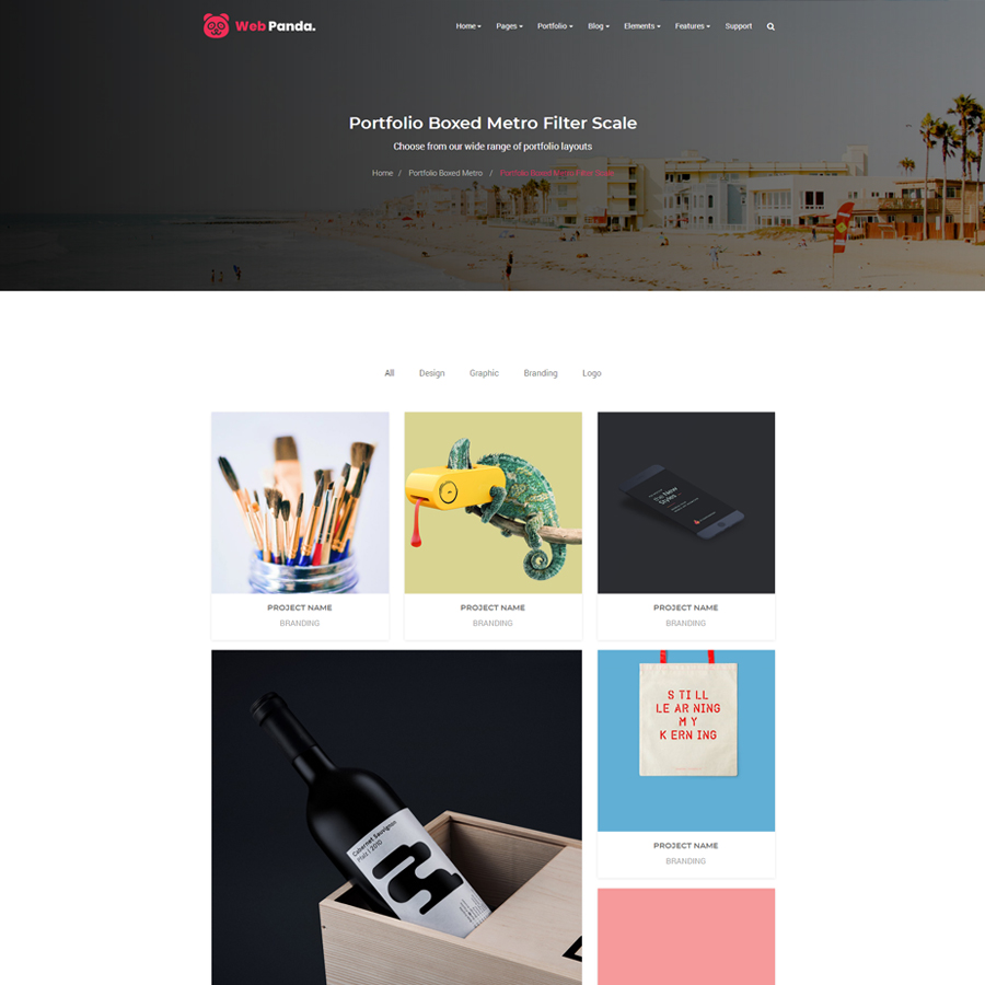
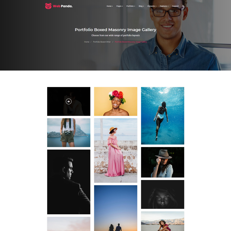
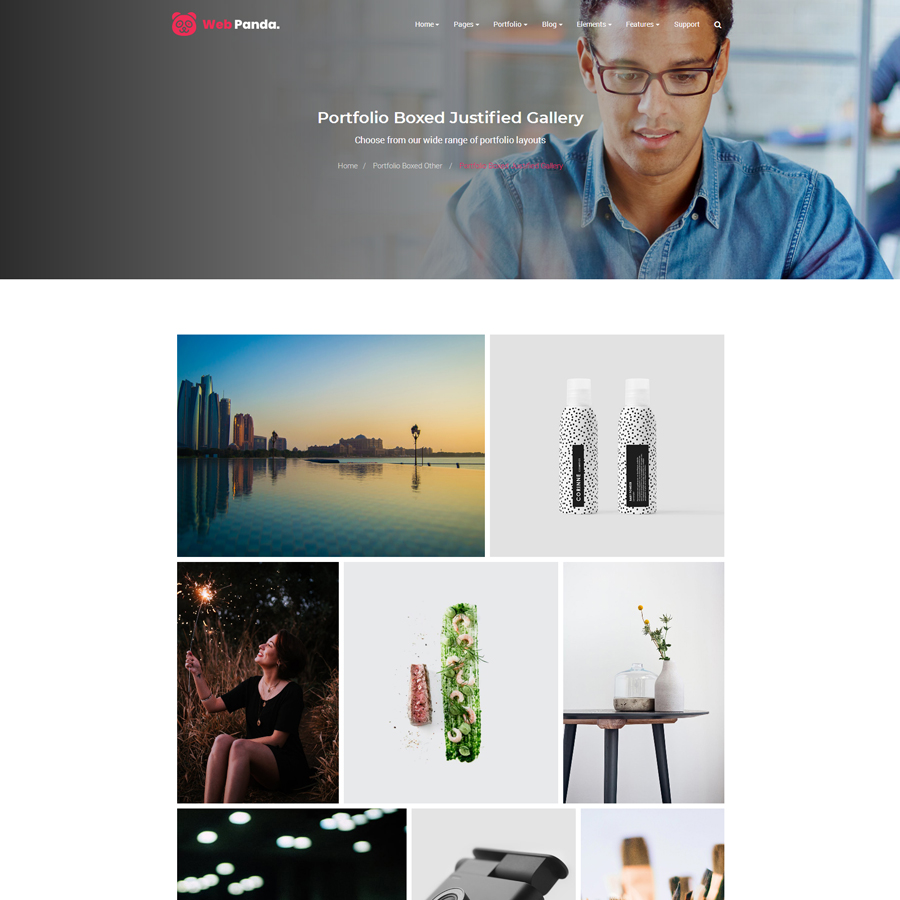
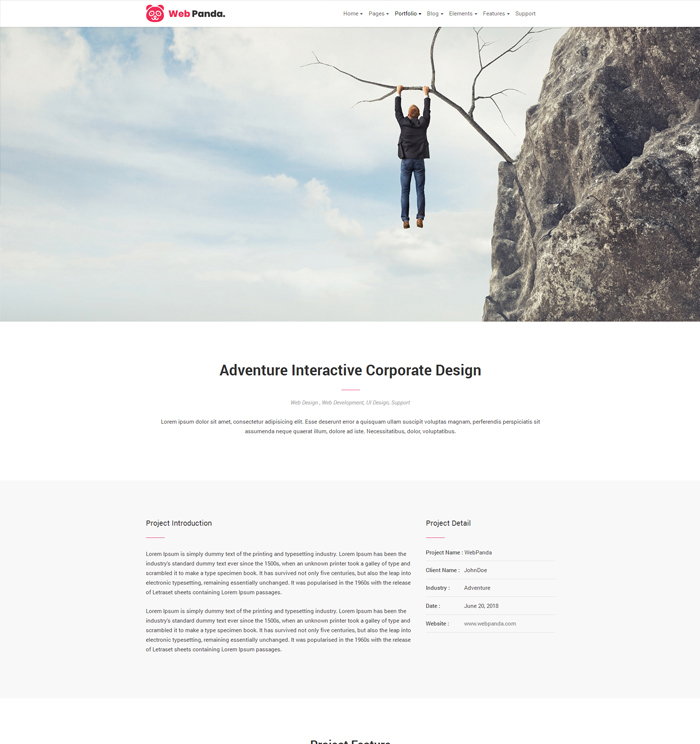
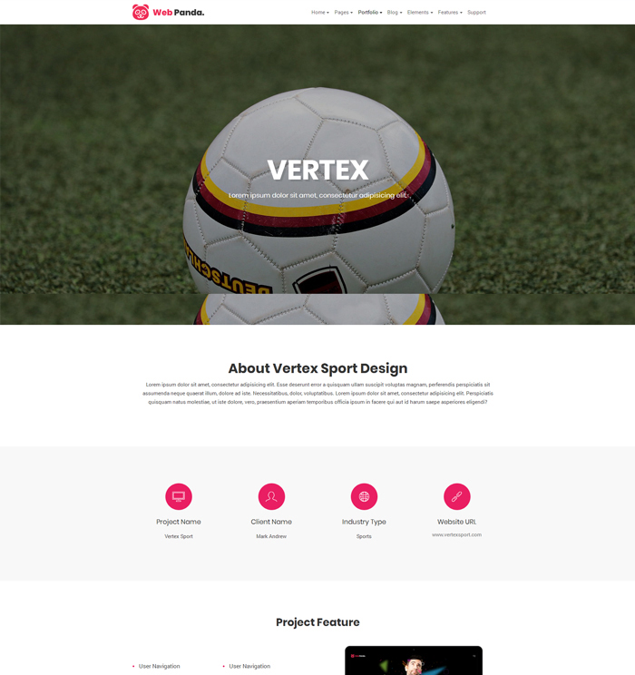
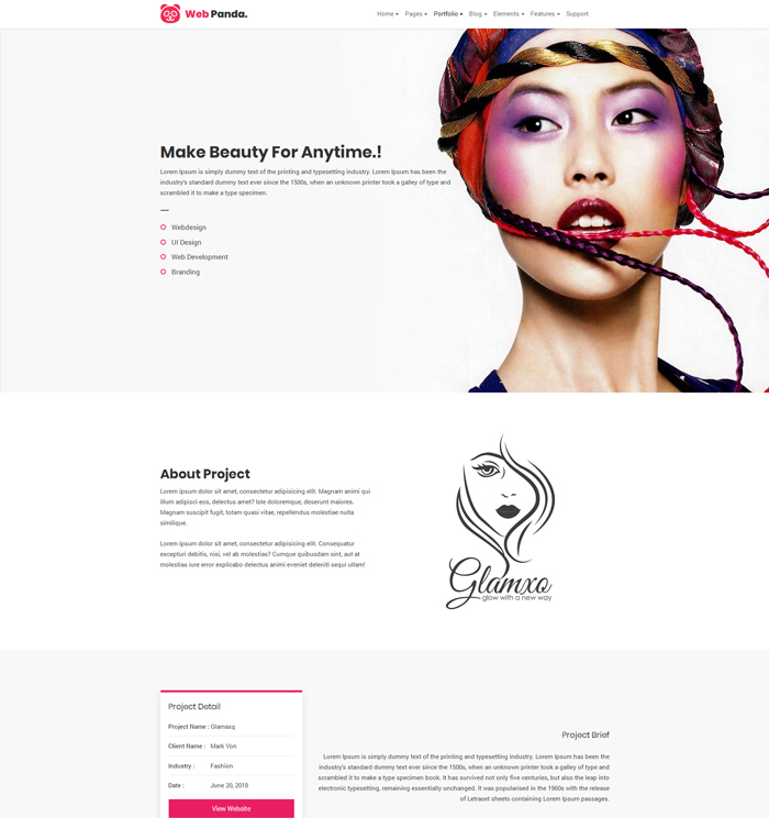
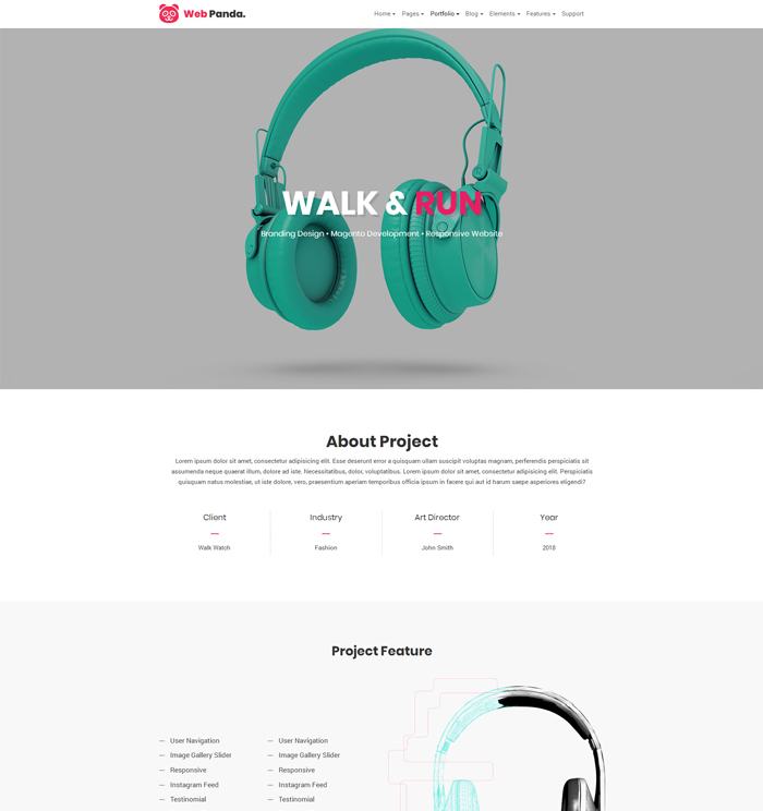
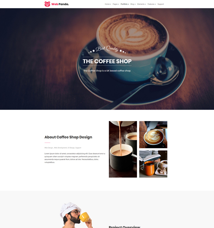
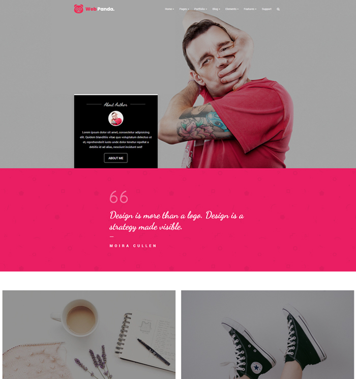
Note : We have created 64+ portfolio layouts page to fully showcase your products and accomplishments. Please check our megamenu for more portfolio variations OR just simply click on below demo images and prefer demos for your reference.
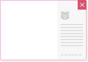
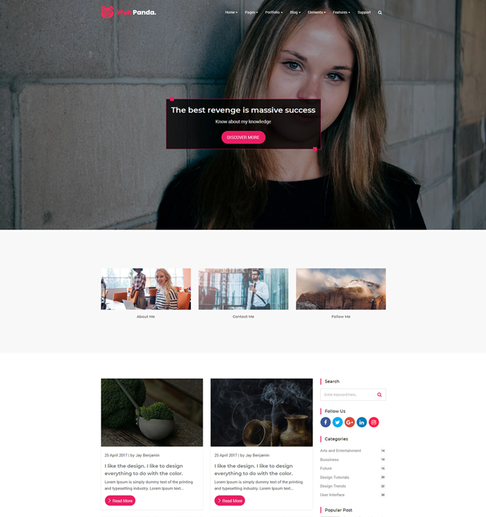
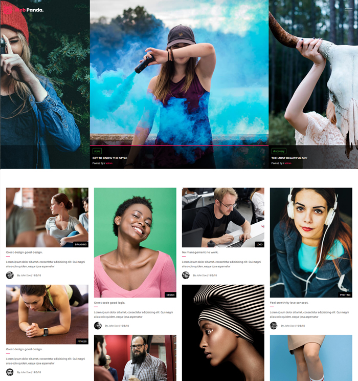
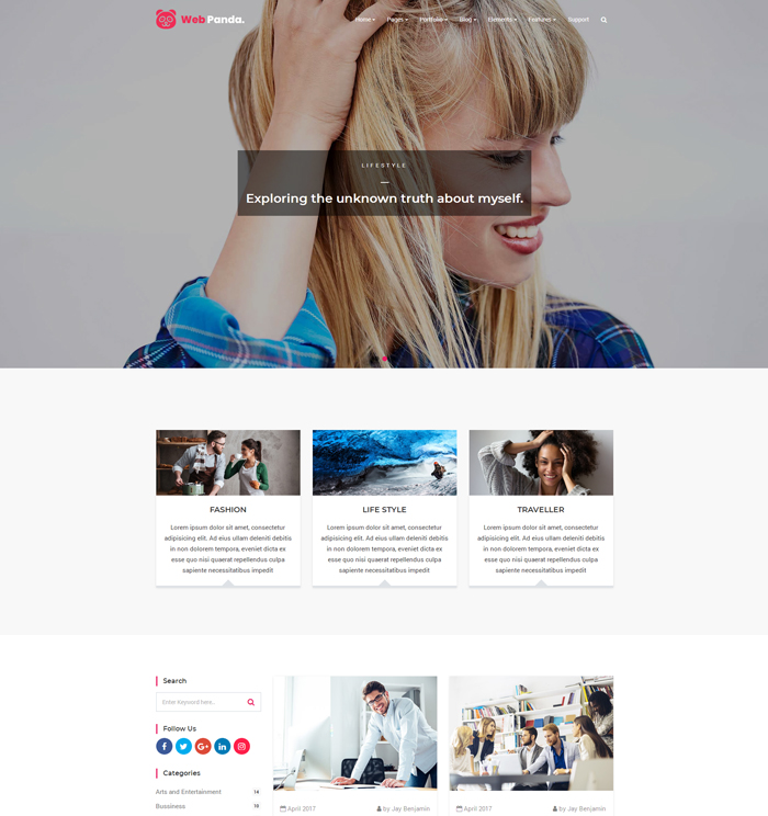
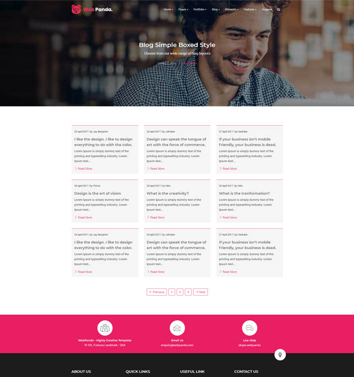
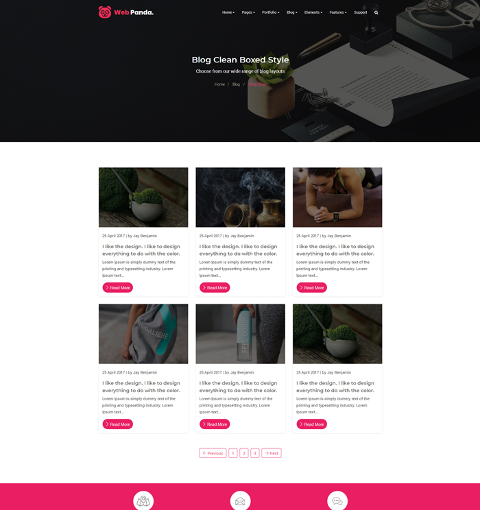
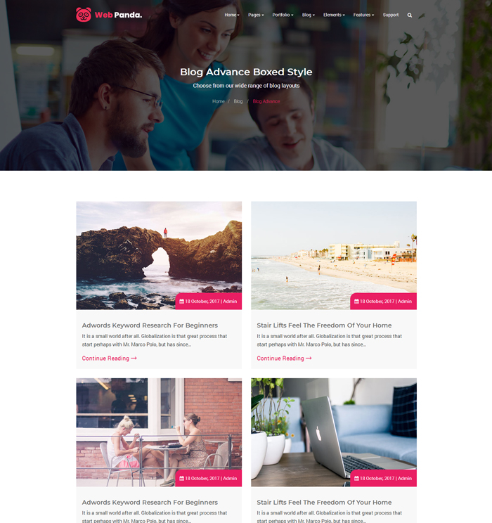
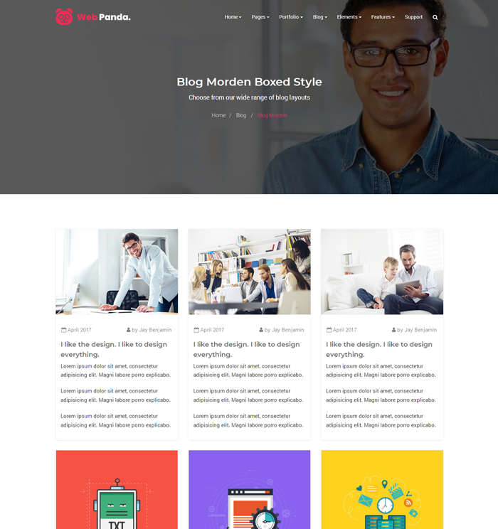
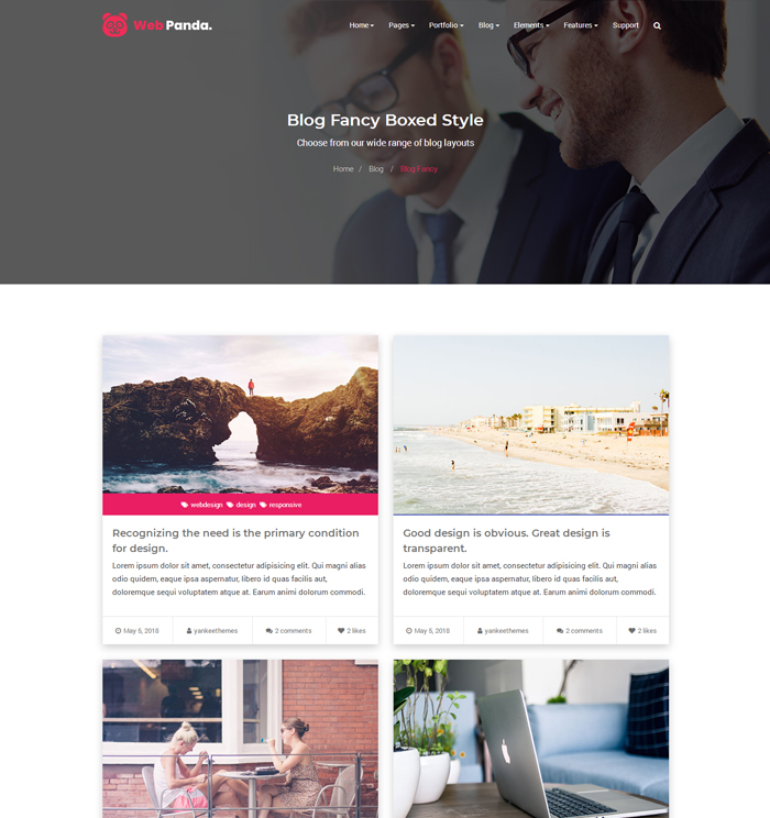
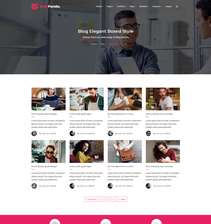
Note : We have created 50+ blog layouts page to fully show your website news and updates.
Please check our megamenu for more blogs variations OR just simply click on below demo images and prefer demos for your reference.
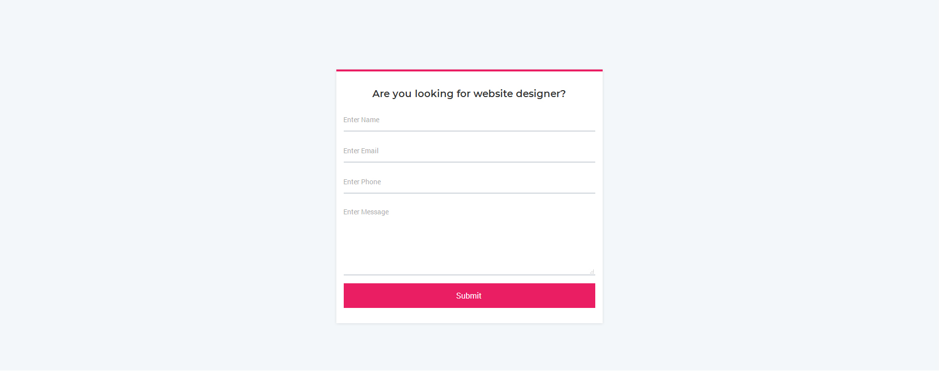
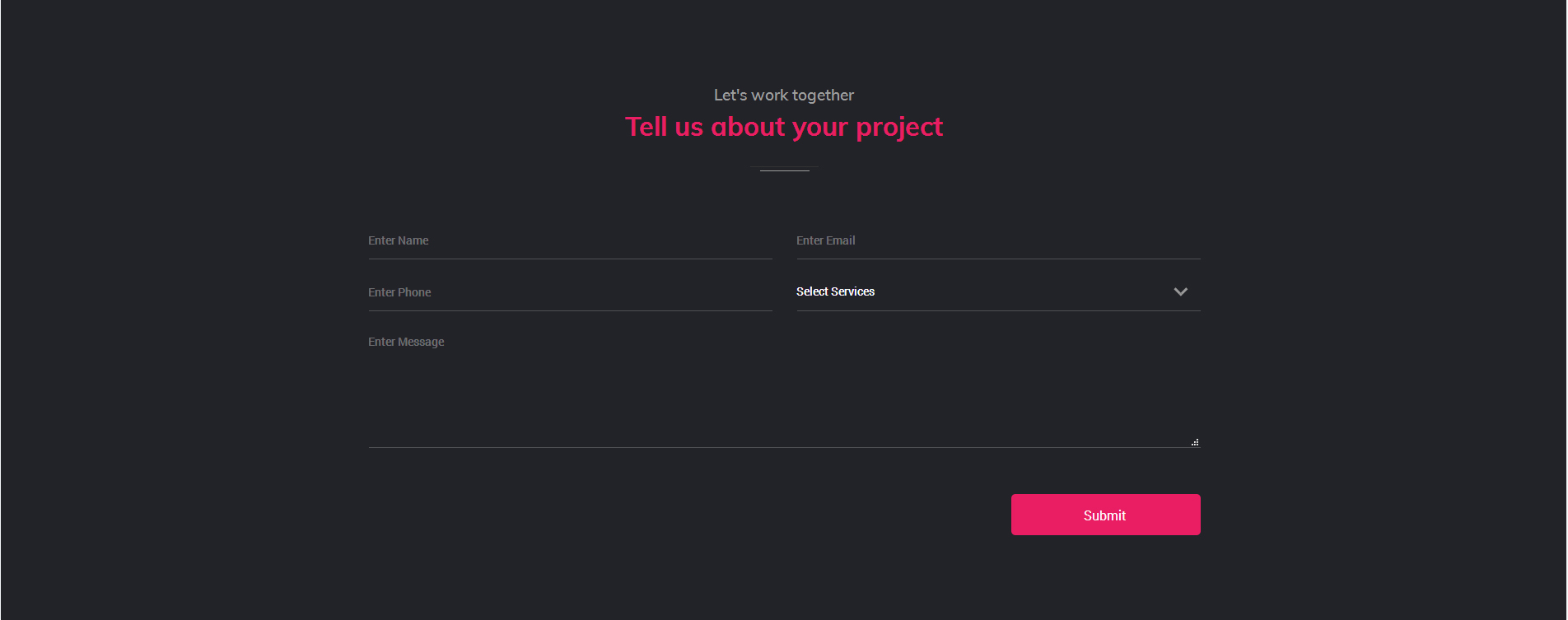
WebPanda created wide range of contact form, inquiry form, quick quote form with more stylist variations.
1. Contact Form
Note : You can find contact form demo in
element-forms.html page for your reference.
2. Inquiry Form
Note : You can find inquiry form demo in
element-forms.html page for your reference.
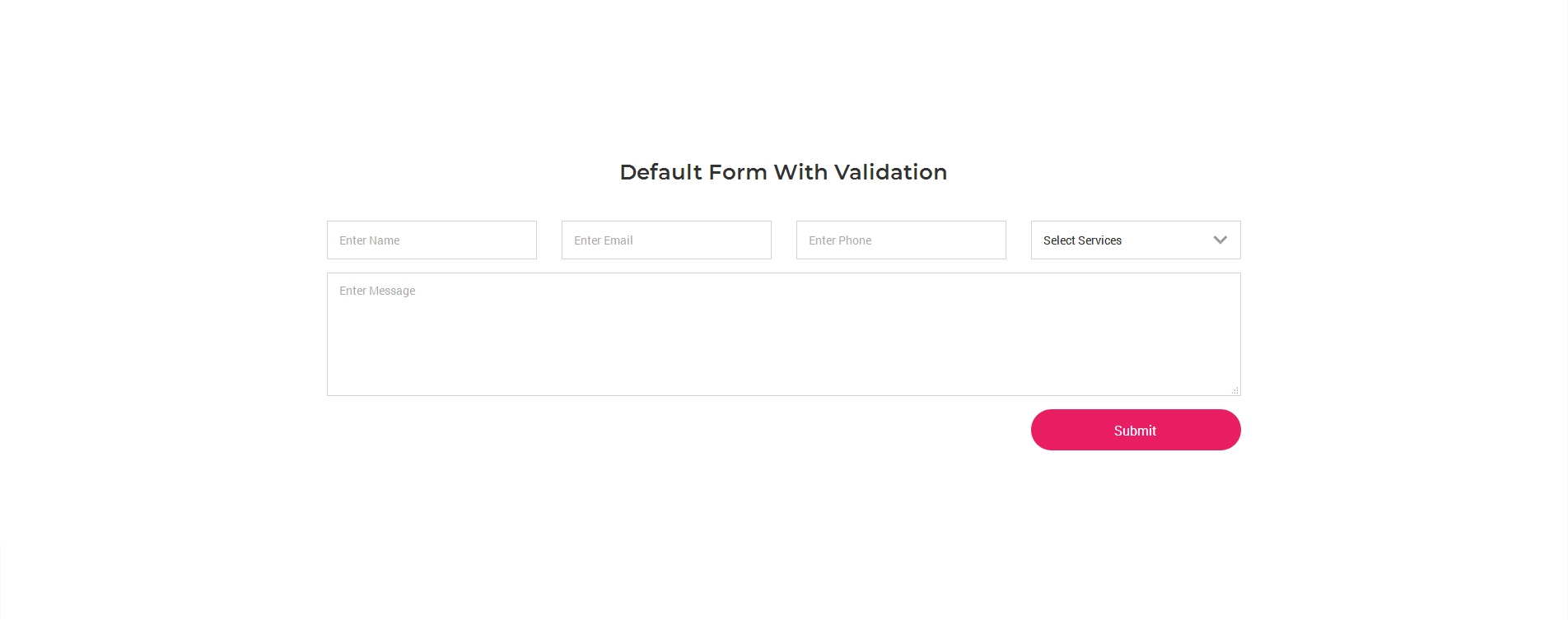
3. Validation Form
Note : You can find validation form demo in
element-forms.html page for your reference.
We have created general validation form for all kind of forms, If you want to change form style with variation just add input-style-1 to input-style-8 class in common-form class. for more information please prefer element-forms.html page for your reference.
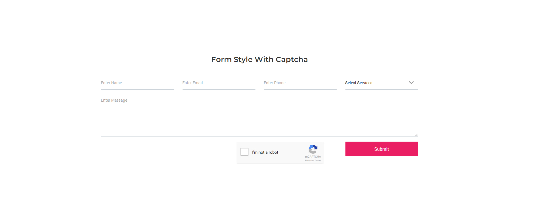
4. Form With Google Captcha
Note : You can find google captcha form demo in
element-forms.html page for your reference.
Google captcha will not work in local host so, you have to generate google captcha key from https://www.google.com/recaptcha/admin and add that captcha key in your form where you want to use.
5. PHP Mailer Settings
Project Inquiry, Contact or any contact related form will not work unless you have your files running on a hosting server with PHP / JS. When you have your files ready on your hosting server, you need to edit the settings to make the mailer function work.
Open email template file yit-contact-form.php and change your setFrom Email Address at the top from [email protected] to your real email address, same way you can change subject line from "Contact Us" or any other as per your need. Also replace yourdomain.com with your real domain name and change
addReplyTo Email Address [email protected].
Note: Email template images will not work in local, so you have to host images in your server in images/email-template folder
and images path should be follow :
Email Template Line Divider Image Path should be : yourdomainname.com/images/email-template/email-divider.png
Email Template Email Banner Image Path should be : yourdomainname.com/images/email-template/email-banner.png
But still If you have any query or confusion related email template setting, Please email us on enquiry[at]yankeeinfoweb[dot]com We will help to you with our best way.
6. Form Helper Classs - Focus state style will auto applied as per the input style
input-radius - for create radius input style
input-rect-round - for create radius rectangle input style
input-rect-rounded - for create radius rounded rectangle input style
input-shadow - for create shadow input style
input-light - for create light input style
input-dark - for create dark input style
input-white-border - for create white input border style
input-black-border - for create black input border style
input-pink-border - for create pink input border style
input-red-border - for create red input border style
input-purple-border - for create purple input border style
input-indigo-border - for create indigo input border style
input-cyan-border - for create cyan input border style
input-teal-border - for create teal input border style
input-green-border - for create green input border style
input-orange-border - for create orange input border style
input-brown-border - for create brown input border style
input-grey-border - for create grey input border style
Reg. form related style please check shortcodes/yit-forms.css for your reference.
Social Feeds
WebPanda provide live social updates on your website with in times of second.
Reg: Twitter API : You can generate twitter api key from
Twitter API website for your reference.
But still If you have any query or confusion related social feeds setting, Please email us on enquiry[at]yankeeinfoweb[dot]com We will help to you with our best way.
Helper Class
We have created wide range of really useful helper classes using .scss for you. Below is the listed for your reference :)
Global Classes
yit-center-items * for center all items
yit-style-none for style none
yit-shadow-none for box-shadow none
yit-radius-none for border-radius none
yit-bg-none for background none
yit-border-none for border none
yit-none-transform for text transform none
yit-overflow for overflow the block
yit-flex for create element using flex
noscroll for hide body scroll using js
Responsive Utilities Class
hidden for hide the html elements
hidden-xs for hidden html elements in mobile
hidden-sm for hidden html elements in small device
hidden-md for hidden html elements in medium device
hidden-lg for hidden html elements in large device
Display Class
yit-display-table for dispaly table element
yit-display-tb-cell for dispaly table-cell element
yit-display-block for dispaly block element
yit-display-inline for dispaly inline element
yit-display-inherit for dispaly inherit or override
yit-display-centrize for dispaly centrize element
yit-display-v-centrize for dispaly verticle centrize element
yit-flex-v-center for dispaly verticle flex center element
yit-flex-h-center for dispaly horizontal flex center element
Position Class
yit-pos-relative for relative element
yit-pos-absoulate for absoulate element
yit-pos-fixed for fixed element
yit-pos-inherit for inherit/override element
yit-pos-h-center for dispaly position horizontal element
yit-pos-v-center for dispaly position verticle element
yit-display-v-centrize for dispaly verticle centrize element
yit-flex-v-center for dispaly verticle flex center element
yit-flex-h-center for dispaly horizontal flex center element
Image Effect
img-scale img for image scale effect
gray-scale for grayscale image effect
Align / Text Effect
text-shadow-light for text shadow light effect
text-opacity-sm for text opacity light effect
text-opacity-lg for text opacity dark effect
Word / Text Break Class
white-space-nowrap
white-space-normal
white-space-pre
word-spacing for spacing the word
Float Class
float-left for floating postion in left
float-rightfor floating postion in right
float-none for remove floating position in block
Image Class
yit-img-left for left align image
yit-img-right for right align image
yit-img-center for center align image
Background Class
yit-bg-h-center for horizontal background image center
yit-bg-v-center for verticle background image center
yit-bg-center for background image center
yit-bg-b-center for background image bottom center
yit-bg-no-repeat for background image no-repeat
yit-bg-repeat for background image repeat
yit-bg for common background image with all elements
Background Position Class
yit-bg-r-b for background-position right bottom
yit-bg-r-t for background-position right top
yit-bg-l-b for background-position left bottom
yit-bg-l-t for background-position left top
yit-bg-r-c for background-position right center
yit-bg-l-c for background-position left center
Background Cover Class
yit-parallax-bg for background parallax image
yit-cover-bg for cover background image
Background Overlay Class
bg-overlay for background overlay image
bg-fade-overlay for background fade overlay image
bg-fade-overlay-dark for background fade overlay dark
bg-fade-graident for background fade graident image
Button Class
yit-btn-full for full button display
yit-btn-center for center button display
yit-btn-auto for auto button display
yit-btn-left for left button display
yit-btn-right for right button display
Margin Top Spacer Class (.mt = margin-top)
mt-0 for margin top 0
mt-5 for margin top 5px space
mt-10 for margin top 10px space
mt-15 for margin top 15px space
mt-20 for margin top 20px space
mt-25 for margin top 25px space
mt-30 for margin top 30px space
mt-40 for margin top 40px space
mt-50 for margin top 50px space
mt-60 for margin top 60px space
mt-70 for margin top 70px space
mt-80 for margin top 80px space
mt-90 for margin top 90px space
mt-100 for margin top 100px space
mt-110 for margin top 110px space
mt-120 for margin top 120px space
mt-130 for margin top 130px space
mt-140 for margin top 140px space
mt-150 for margin top 150px space
Margin Right Spacer Class (.mr = margin-right)
mr-0 for margin right 0
mr-10 for margin right 10px space
mr-15 for margin right 15px space
mr-20 for margin right 20px space
mr-30 for margin right 30px space
mr-40 for margin right 40px space
mr-50 for margin right 50px space
mr-60 for margin right 60px space
mr-70 for margin right 70px space
mr-80 for margin right 80px space
mr-90 for margin right 90px space
mr-100 for margin right 100px space
mr-110 for margin right 110px space
mr-120 for margin right 120px space
mr-130 for margin right 130px space
mr-140 for margin right 140px space
mr-150 for margin right 150px space
Margin Bottom Spacer Class (.mb = margin-bottom)
mb-0 for margin bottom 0
mb-10 for margin bottom 10px space
mb-15 for margin bottom 15px space
mb-20 for margin bottom 20px space
mb-30 for margin bottom 30px space
mb-40 for margin bottom 40px space
mb-50 for margin bottom 50px space
mb-60 for margin bottom 60px space
mb-70 for margin bottom 70px space
mb-80 for margin bottom 80px space
mb-90 for margin bottom 90px space
mb-100 for margin bottom 100px space
mb-110 for margin bottom 110px space
mb-120 for margin bottom 120px space
mb-130 for margin bottom 130px space
mb-140 for margin bottom 140px space
mb-150 for margin bottom 150px space
Margin Left Spacer Class (.ml = margin-left)
ml-0 for margin left 0
ml-10 for margin left 10px space
ml-15 for margin left 15px space
ml-20 for margin left 20px space
ml-30 for margin left 30px space
ml-40 for margin left 40px space
ml-50 for margin left 50px space
ml-60 for margin left 60px space
ml-70 for margin left 70px space
ml-80 for margin left 80px space
ml-90 for margin left 90px space
ml-100 for margin left 100px space
ml-110 for margin left 110px space
ml-120 for margin left 120px space
ml-130 for margin left 130px space
ml-140 for margin left 140px space
ml-150 for margin left 150px space
Padding Top Spacer Class (.pt = paddding-top)
pt-0 for padding top 0
pt-5 for padding top 5px space
pt-10 for padding top 10px space
pt-15 for padding top 15px space
pt-20 for padding top 20px space
pt-25 for padding top 25px space
pt-30 for padding top 30px space
pt-40 for padding top 40px space
pt-50 for padding top 50px space
pt-60 for padding top 60px space
pt-70 for padding top 70px space
pt-80 for padding top 80px space
pt-90 for padding top 90px space
pt-100 for padding top 100px space
pt-110 for padding top 110px space
pt-120 for padding top 120px space
pt-130 for padding top 130px space
pt-140 for padding top 140px space
pt-150 for padding top 150px space
Padding Bottom Spacer Class (.pb = paddding-bottom)
pb-0 for padding bottom 0
pb-5 for padding bottom 5px space
pb-10 for padding bottom 10px space
pb-15 for padding bottom 15px space
pb-20 for padding bottom 20px space
pb-25 for padding bottom 25px space
pb-30 for padding bottom 30px space
pb-40 for padding bottom 40px space
pb-50 for padding bottom 50px space
pb-60 for padding bottom 60px space
pb-70 for padding bottom 70px space
pb-80 for padding bottom 80px space
pb-90 for padding bottom 90px space
pb-100 for padding bottom 100px space
pb-110 for padding bottom 110px space
pb-120 for padding bottom 120px space
pb-130 for padding bottom 130px space
pb-140 for padding bottom 140px space
pb-150 for padding bottom 150px space
Padding Left Spacer Class (.pl = paddding-left)
pl-0 for padding left 0
pl-5 for padding left 5px space
pl-10 for padding left 10px space
pl-15 for padding left 15px space
pl-20 for padding left 20px space
pl-25 for padding left 25px space
pl-30 for padding left 30px space
pl-40 for padding left 40px space
pl-50 for padding left 50px space
pl-60 for padding left 60px space
pl-70 for padding left 70px space
pl-80 for padding left 80px space
pl-90 for padding left 90px space
pl-100 for padding left 100px space
pl-110 for padding left 110px space
pl-120 for padding left 120px space
pl-130 for padding left 130px space
pl-140 for padding left 140px space
pl-150 for padding left 150px space
Padding Right Spacer Class (.pr = paddding-right)
pr-0 for padding right 0
pr-5 for padding right 5px space
pr-10 for padding right 10px space
pr-15 for padding right 15px space
pr-20 for padding right 20px space
pr-25 for padding right 25px space
pr-30 for padding right 30px space
pr-40 for padding right 40px space
pr-50 for padding right 50px space
pr-60 for padding right 60px space
pr-70 for padding right 70px space
pr-80 for padding right 80px space
pr-90 for padding right 90px space
pr-100 for padding right 100px space
pr-110 for padding right 110px space
pr-120 for padding right 120px space
pr-130 for padding right 130px space
pr-140 for padding right 140px space
pr-150 for padding right 150px space
General Padding Class (.pad = paddding)
pad-5-all for padding 5px all side
pad-10-all for padding 10px all side
pad-15-all for padding 15px all side
pad-20-all for padding 20px all side
pad-25-all for padding 25px all side
pad-30-all for padding 30px all side
pad-35-all for padding 35px all side
pad-40-all for padding 40px all side
pad-50-all for padding 50px all side
pad-60-all for padding 60px all side
pad-70-all for padding 70px all side
pad-80-all for padding 80px all side
pad-90-all for padding 90px all side
pad-100-all for padding 100px all side
pl-pr-zero for padding 0 left & paddding 0 right
pt-pb-zero for padding 0 top & paddding 0 bottom
p-0 for padding 0 from all side
General Margin Class (.mrg = margin)
m-0 for margin 0 from all side
m-h-auto for margin auto from horizontal side
m-v-auto for margin auto from verticle side
mrg-5-all for margin 5px all side
mrg-10-all for margin 10px all side
mrg-15-all for margin 15px all side
mrg-20-all for margin 20px all side
mrg-25-all for margin 25px all side
mrg-30-all for margin 30px all side
mrg-40-all for margin 40px all side
mrg-50-all for margin 50px all side
General Width Class
width-30 for 30px width
width-50 for 50px width
width-70 for 70px width
width-100 for 100px width
width-150 for 150px width
width-200 for 200px width
width-250 for 250px width
width-300 for 300px width
width-half for half width
width-full for full width
max-width-none for override max-width:100 to none
General Height Class
height-50 for 50px height
height-100 for 100px height
height-150 for 150px height
height-200 for 200px height
height-230 for 230px height
height-260 for 260px height
height-290 for 290px height
height-320 for 320px height
height-350 for 350px height
height-380 for 380px height
height-410 for 410px height
height-440 for 440px height
height-470 for 470px height
height-500 for 500px height
height-550 for 550px height
height-xxxsmall-screenfor height 100px screen
height-xxsmall-screenfor height 200px screen
height-xsmall-screenfor height 300px screen
height-small-screenfor height 400px screen
height-one-second-screenfor height 600px screen
height-one-third-screenfor height 700px screen
height-one-fourth-screenfor height 800px screen
height-one-fifth-screenfor height 900px screen
height-one-sixth-screenfor height 1000px screen
height-fullfor height 100% full screen
height-coverfor height 100vh full viewport screen
flex-full-heightfor height 100% with flex
flex-box-spacerfor applied margin-bottom space in column
General Gutter Class
no-gutter-mrg for remove margin from row
no-gutter for remove padding from column
none-row-space for applied margin none in row using psuedo
Letter Spacing Class
no-letter-spacing for letter-spacing 0px
letter-spacing-1 for letter-spacing 1px
letter-spacing-2 for letter-spacing 2px
letter-spacing-3 for letter-spacing 3px
letter-spacing-4 for letter-spacing 4px
letter-spacing-5 for letter-spacing 5px
letter-spacing-6 for letter-spacing 6px
letter-spacing-7 for letter-spacing 7px
letter-spacing-8 for letter-spacing 8px
letter-spacing-9 for letter-spacing 9px
letter-spacing-10 for letter-spacing 10px
Position Space Class (you should add position:relative for pos-t class)
pos-t-25 for position top 25px
pos-t-35 for position top 35px
pos-t-45 for position top 45px
pos-t-55 for position top 45px
pos-t-65 for position top 65px
pos-t-75 for position top 75px
pos-t-85 for position top 85px
pos-t-95 for position top 95px
pos-t-105 for position top 105px
pos-t-0 for position top 0
pos-b-0 for position bottom 0
pos-l-0 for position left 0
pos-r-0 for position right 0
Z-Index Class
z-index-1111 for top z-index 1111
z-index-111 for top z-index 111
z-index-0 for top z-index 0
z-index-1 for top z-index 1
z-index-2 for top z-index 2
z-index-3 for top z-index 3
z-index-4 for top z-index 4
z-index-5 for top z-index 5
z-index-10 for top z-index 10
Border Class
bdr-l-0 for border-left none
bdr-r-0 for border-right none
bdr-t-0 for border-top none
bdr-b-0 for border-bottom none
border-all for all side border
border-width-1 for 1px width
border-width-2 for 2px width
border-width-3 for 3px width
border-width-4 for 4px width
border-width-5 for 5px width
border-width-6 for 6px width
border-width-7 for 7px width
border-width-8 for 8px width
border-width-9 for 9px width
border-width-10 for 10px width
border-width-20 for 20px width
Border Direction Class
border-top for border-top 1px
border-bottom for border-bottom 1px
border-left for border-left 1px
border-right for border-right 1px
border-lr for border-left & border-right 1px
border-tb for border-top & border-bottom 1px
Border Specific Direction Class
border-top-only for border-top only
border-bottom-only for border-bottom only
border-left-only for border-left only
border-right-only for border-right only
Border Utility Class
border-r-none for border-right none only
border-t-none for border-top none only
border-b-none for border-bottom none only
border-l-none for border-left none only
border-none for border none from all slide
Border Style Class
border-style-dotted for border dotted style
border-style-dashed for border dashed style
border-style-solid for border solid style
border-style-double for border double style
border-style-groove for border groove style
border-style-ridge for border ridge style
border-style-inset for border inset style
border-style-outset for border outset style
border-style-disp-none for border style disp-none style
border-style-transperent for border color transparent style
Typography Class
font-weight-thin for font-weight 100 style
font-weight-extra-light for font-weight 200 style
font-weight-light for font-weight 300 style
font-weight-regular for font-weight 400 style
font-weight-medium for font-weight 500 style
font-weight-semibold for font-weight 600 style
font-weight-bold for font-weight 700 style
font-weight-xtrabold for font-weight 800 style
font-weight-black for font-weight 900 style
font-italic for font italic style
line-height-normal for line-height normal style
Font Sizing Class
font-xxlarge for font size double large style
font-xlarge for font size medium double large style
font-large for font size large style
font-medium for font size medium style
font-small for font size small style
font-xsmall for font size extra small style
font-xxsmall for font size double extra small style
font-xxxsmall for font size xxxsmall small style
font-extrasmall for font size xxxxsmall style
Image Variation Class
img-circle for create circle image
img-round for create radius images
img-rounded for create radius rounded images
img-xxrounded for create 50% rounded images
img-shadow for create shdow images
img-shadow-dark for create shdow dark images
Icon Size Variation Class
icon-large for large size icon
icon-medium for medium size icon
icon-small for small size icon
icon-xsmall for extra small size icon
Icon Variation Class
icon-circle for create circle icon
icon-circle-small for create circle icon with small size
icon-flat for create flat icon
icon-round for create radius icon
icon-rounded for create radius rounded icon
icon-border for create border icon
icon-shadow for create shadow icon
icon-shadow-dark for create shadow dark icon
icon-mini for create minimum size icon
Button Variation Class
btn-border for create border button
btn-radius for create radius button
btn-rounded for create radius rounded button
btn-circle for create circle button
btn-shadow for create shadow button
Button Size Class
btn-large for create large button
btn-medium for create medium button
btn-small for create small button
btn-xsmall for create extra small button
btn-xxsmall for create xxsmall button
btn-xxxsmall for create xxxsmall button
Button Color Variation Class - Hover button auto applied using dark color
btn-white for create white button
btn-black for create black button
btn-blue for create blue button
btn-red for create red button
btn-purple for create purple button
btn-indigo for create indigo button
btn-cyan for create cyan button
btn-teal for create teal button
btn-green for create green button
btn-yellow for create yellow button
btn-orange for create orange button
btn-brown for create brown button
btn-grey for create grey button
Button Border Variation Class - Hover button auto applied using button color
btn-white-border for create white border button
btn-black-border for create black border button
btn-pink-border for create pink border button
btn-blue-border for create blue border button
btn-red-border for create red border button
btn-purple-border for create purple border button
btn-indigo-border for create indigo border button
btn-cyan-border for create cyan border button
btn-teal-border for create teal border button
btn-green-border for create green border button
btn-orange-border for create orange border button
btn-brown-border for create brown border button
btn-yellow-border for create yellow border button
Background Color Variation Class - Text color auto applied as per appropriate background color
primary-color-bg for create primary color background
blue-color-bg for create blue color background
white-color-bg for create white color background
black-color-bg for create black color background
pink-color-bg for create pink color background
red-color-bg for create red color background
purple-color-bg for create purple color background
indigo-color-bg for create indigo color background
cyan-color-bg for create cyan color background
teal-color-bg for create teal color background
green-color-bg for create green color background
yellow-color-bg for create yellow color background
orange-color-bg for create orange color background
brown-color-bg for create brown color background
grey-color-bg for create grey color background
light-grey-color-bg for create light-grey color background
dark-grey-black-color-bg for create dark-grey-black color background
light-grey-black-color-bg for create light-grey-black color background
light-medium-grey-color-bg for create light-medium-grey color background
light-extra-grey-color-bg for create light-extra-grey color background
black-extra-grey-color-bg for create black-extra-grey color background
bg-extra-dark-transparent for create extra dark transparent background
bg-dark-transparent for create dark transparent background
bg-dark-light-transparent for create dark light transparent background
space-grey-color-bg for create sapce grey background
space-grey-light-color-bg for create sapce grey light color background
Color Variation Class
primary-color-bg for create primary body color
blue-color-text for create blue text
white-color-text for create white text
black-color-text for create black text
pink-color-text for create pink text
red-color-text for create red text
purple-color-text for create purple text
indigo-color-text for create indigo text
cyan-color-text for create cyan text
teal-color-text for create teal text
green-color-text for create green text
yellow-color-text for create yellow text
orange-color-text for create orange text
brown-color-text for create brown text
dark-grey-black-color-text for create dark grey black text
light-grey-black-color-text for create light grey black text
light-medium-grey-color-text for create light medium grey text
light-extra-grey-color-text for create light extra grey text
Border Color Variation Class
primary-color-border for create primary body color border
blue-color-border for create blue color border
white-color-border for create white color border
black-color-border for create black color border
pink-color-border for create pink color border
red-color-border for create red color border
purple-color-border for create purple color border
indigo-color-border for create indigo color border
cyan-color-border for create cyan color border
teal-color-border for create teal color border
green-color-border for create green color border
yellow-color-border for create yellow color border
orange-color-border for create orange color border
brown-color-border for create brown color border
grey-color-border for create grey color border
Hyperlink Color Variation Class - Hover link auto applied using dark color
link-white for create white color link
link-black for create black color link
link-pink for create pink color link
link-red for create red color link
link-purple for create purple color link
link-indigo for create indigo color link
link-cyan for create cyan color link
link-teal for create teal color link
link-green for create green color link
link-orange for create orange color link
link-brown for create brown color link
link-grey for create grey color link
Social Icon Variation Class
social-circle for create circle social icon
social-round for create radius social icon
social-rounded for create radius round social icon
social-shadow for create shadow social icon
How To Add Cookie?
Don't know how to add cookie in your website? then don't worrry just follow below step for make your website GDPR Compliance. just add below reference code in your page before
</body>tag closed.
<link rel="stylesheet" type="text/css" href="http://cdnjs.cloudflare.com/ajax/libs/cookieconsent2/3.1.0/cookieconsent.min.css" />
<script src="//cdnjs.cloudflare.com/ajax/libs/cookieconsent2/3.1.0/cookieconsent.min.js"></script>
<script>
window.addEventListener("load", function(){
window.cookieconsent.initialise({
  "palette": {
    "popup": {
      "background": "#000"
    },
    "button": {
      "background": "#f1d600"
    }
    revokable:true,
      "content": {
        "message": "We use cookies to ensure that we give you the best experience on our websites. If you continue we'll assume that you are happy to receive these cookies. If you'd like to find out more",
        "href": "https://cookiesandyou.com/", // Add your cookie page here
        link: 'Please click here'
    }
  }
})});
</script>
</body>
Reg: Cookie Consent : Still, if you have any query or confusion, you can download cookie consent code from
Cookie Consent website for your reference.
Installation Help
Don't know how to upload website source on FTP? Would like the website installation to be done by a professional? Feel free to address Envato Studio to get high-quality help installing your website.
Have doubts or need help?
Then simply email on our Support email at enquiry[at]yankeeinfoweb[dot]com OR visit our Themeforest profile at
Yankee Themes and generate the message, We will be back with professional help quickly. Expect a response Monday to Friday 10:00 to 18:00 (GMT +5:30) within 1 business day. Our team is open to our customers and aim at getting better!
We are a expert and trusted team of full-time developers having 7+year experience. Sharing the same goals and putting our best knowledge into what we do make us successful. One of our priorities is to bring the feeling of satisfaction with our items to the clients! So you can always rely on us!
Support
Fixing Bugs
If our template doesn't work correctly for your website? Report your issue or bug by describing it in details and send us a link to your website. We'll do our best to find a solution.
Life-time updates
We introduce new updates and features regularly. Just check for more informatio in our version history.
Customer-friendly suggestion
We are open to your ideas. If you require some additional features, which could as well improve our product, just share it with us. We will consider adding them in our future updates.
Doesn't Includes
Third-party issues
We do not fix bugs or resolve issues of other plugins and themes, created by third party developers. Also we don't supply integration services for third party widgets and themes.
Source & Credits
We would really love to take this opportunity to appreciate guys whose items were helpful to us to make WebPanda a really beautiful theme for our awesome users
If you need any help using the file or need special customizing please feel free to contact me via my Themeforest profile. If you have a moment, please rate this item, I'll appreciate it very much!....Thank you. :)
Finally, thank you for visiting our item. If you love it, don't forget to give us 5 Stars rate from your download's page. If you need any question regarding this item, please feel free to contact us at enquiry[at]yankeeinfoweb[dot]com.
Business Hour
We'll happy to talk you, don't hesitate to mail us if there is any problem with our products or you just want to email. Support requests are being processed on business days Monday to Friday 10:00 to 18:00 (GMT +5:30) within 1 business day.


Social Feeds
WebPanda provide live social updates on your website with in times of second.
1. Instagram Feed
Note : You can find instagram feed demo in element-instagram.html page for your reference.
1.1 Instagram Markup
Below is the instagram
js/yit-custom.jsmarkup only for your reference2. Twitter Feed
You can find twitter markup code from
js/yit-custom.jsonly for your referenceNote : You can find twitter feed demo in element-twitter-feed.html page for your reference.